Generate beautiful websites! No code, free, with AI. Export and publish anywhere.
An intuitive design interface is crucial for facilitating a seamless user experience. It allows both novice and professional designers to navigate and use the web design program with ease. An interface that is well-organized and straightforward minimizes the learning curve, enabling users to start their design projects without the frustration of a complicated setup. This ensures that creativity is not hampered by technical limitations, encouraging a more fluid and dynamic approach to web design.
An advanced toolset within a web design program provides users with a comprehensive array of features to create detailed and sophisticated websites. These tools often include high-end graphic editing capabilities, CSS grid frameworks, and interactive elements that allow designers to push the boundaries of traditional web design. The ability to fine-tune every aspect of a website's appearance and functionality enriches the design process, making it possible to achieve professional-level results that stand out in the digital space.
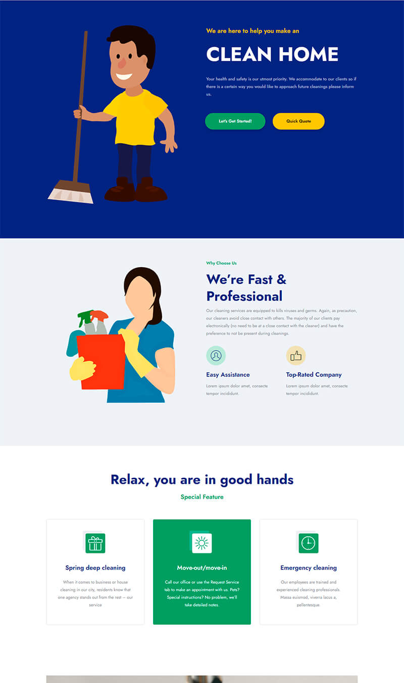
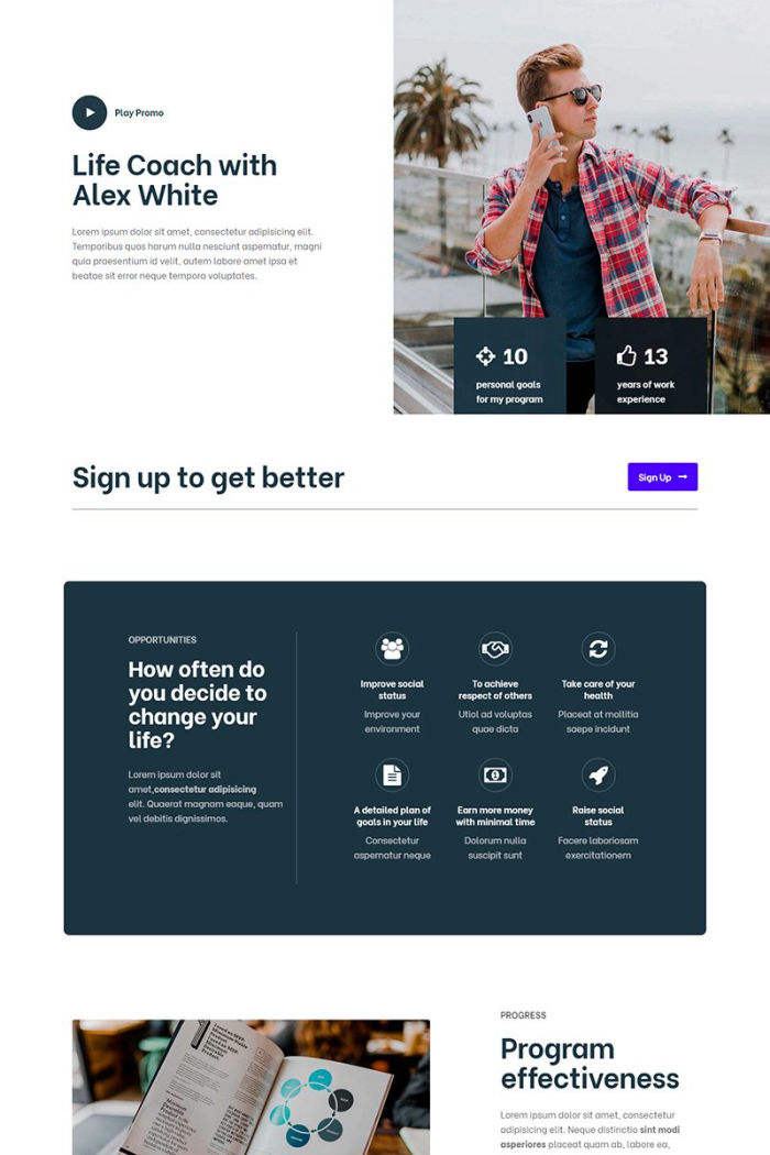
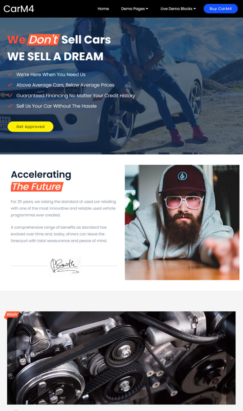
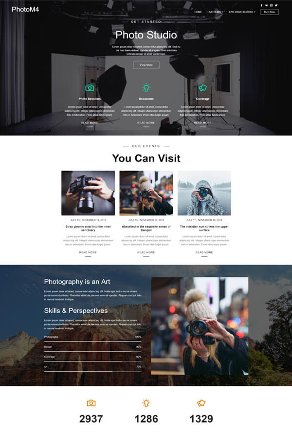
An extensive template library is a key feature that significantly speeds up the web design process. Offering a wide variety of pre-designed templates allows users to choose and customize a template that closely matches their vision, saving time and effort. This feature is especially beneficial for those who seek inspiration or need to create a website quickly without compromising on quality. Templates cater to various industries and styles, ensuring that users can find a suitable starting point for any project.
Seamless collaboration features within a web design program enable teams to work together efficiently, regardless of their location. This includes real-time editing, shared asset libraries, and communication tools integrated directly into the design environment. Such capabilities ensure that team members can contribute, provide feedback, and make decisions quickly, leading to a more cohesive and dynamic development process. It helps in maintaining a unified vision among designers, developers, and stakeholders, ultimately resulting in a more harmonious and effective final product.
Responsive design tools are essential for creating websites that look great and function well on any device. These tools allow designers to preview and adjust layouts, images, and typography to ensure that content is accessible and visually appealing across different screen sizes and resolutions. The ability to test and tweak designs in real-time for tablets, smartphones, and desktops simplifies the workflow and validates the user experience before launch. This not only enhances the website's usability but also contributes to better search engine rankings.
A cloud-based operation allows web designers to access their projects and tools from anywhere, on any device, promoting flexibility and mobility in the design process. It eliminates the need for heavy software installations and ensures that all updates and new features are immediately available. Additionally, cloud storage offers a secure way to save and backup work, reducing the risk of data loss. This feature supports a modern, on-the-go lifestyle and caters to the needs of freelancers and teams who might not always be anchored to a single workstation.
The integration of AI generation within a web design program transforms the creative process, offering innovative solutions that can auto-generate design elements based on user input. This can include everything from color schemes and font pairings to full webpage layouts, significantly reducing the time and effort required to make design decisions. AI-driven features can also suggest optimizations for better user experience and accessibility, making it easier for designers to meet high standards without extensive manual testing. This forward-thinking approach empowers designers to focus more on creativity and less on repetitive tasks.
The ability to export and publish projects anywhere directly from the web design program streamlines the process of taking a website live. Users can easily export their designs in various formats or integrate with content management systems and web hosts through built-in options or plugins. This feature removes the technical barriers often associated with website deployment, making it accessible for designers of all skill levels to efficiently publish their work. It ensures that the transition from design to live site is as smooth and trouble-free as possible, encouraging more creative experimentation and accessibility to web design.
Having an offline mode in a web design program offers the invaluable flexibility of working without an internet connection. This feature is especially useful for users who are traveling or in areas with unreliable internet access. It ensures that productivity is not hindered by external circumstances, allowing for uninterrupted work on projects. Once online, any changes can be synchronized, ensuring that no work is lost, and everything is up-to-date. This capability supports a truly flexible working environment, catering to the needs of freelancers and professionals who require constant access to their design tools and projects.

The first step in creating a website with Mobirise is to download the Mobirise app from its official website. After visiting the site, select the version that is compatible with your operating system. Install the application following the installation guide. Registration isn’t mandatory for the basic features, but consider creating an account for access to more advanced functionalities.
Upon launching Mobirise, you will be prompted to choose how to start your website project. You have the option to begin with AI (Artificial Intelligence) which guides you through the setup, use a pre-designed template that fits your project's theme, or start from scratch with a blank page. Consider your project needs and level of expertise when making this decision.
Mobirise operates on a block-based system, making it easy to add sections to your website by dragging and dropping different types of blocks. These blocks can be anything from headers, galleries, sliders, or contact forms. Customize these by clicking on them and using the in-built tools to change texts, images, and styles to match your desired look and feel.
Before going further, it's essential to adjust your site settings. Access the site settings menu to configure general settings, including your site's title, language, and favicon. SEO settings are also crucial at this point to ensure your site is optimized for search engines. Fill in keywords, descriptions, and other metadata to improve your site's searchability and ranking.
After customizing your site, utilize the Preview function in Mobirise to see how your website looks across different devices, including desktops, tablets, and smartphones. This step is critical to ensure that your site is responsive and provides a good user experience. Test all links, buttons, and forms to verify that they work as expected and make any necessary adjustments.
The final step is to publish your website. Mobirise offers several options for publishing: you can publish directly to a local drive, upload via FTP to your hosting provider, or connect to a Google Drive. Choose the method that best suits your needs. After publishing, ensure to share your new website with the world through your social media channels and other marketing efforts.
Mobirise is a user-friendly, offline website builder designed for non-tech-savvy individuals to create stunning, responsive websites without prior coding knowledge. It operates on a drag-and-drop interface, simplifying the web design process into purely visual tasks. This software provides a wide array of contemporary, mobile-optimized templates across various business niches, alongside extensive customization options through its modular building block system. Users can easily integrate social media, contact forms, images, and even video content, enhancing site functionality and engagement. Mobirise also supports direct publishing to a chosen domain, facilitating a smooth transition from design to live website. Elevate your web design experience by downloading Mobirise for Windows or Mac using the buttons below or explore cutting-edge possibilities with its AI feature.
Mobirise is an offline web design program that offers user-friendly drag-and-drop interface, enabling users to create small to medium-sized websites, landing pages, online resumes, and portfolios effortlessly, without the need for deep coding knowledge. It provides a vast array of contemporary, fully responsive templates suitable for various industries and purposes. Mobirise enhances web development with features like image/content sliders, contact forms, social media blocks, and Google Maps integration. Its AMP (Accelerated Mobile Pages) support ensures fast-loading, mobile-optimized websites. Ideal for non-tech-savvy users and professionals alike, it streamlines web creation, making it accessible to everyone. Optimize your web design experience by downloading Mobirise using the buttons below.
I chose this web design program after extensive research, primarily because of its extensive range of templates that seemed highly customizable and the promise of seamless integration with various plugins and external tools. The initial setup was a breeze, and I was quickly impressed by the drag-and-drop interface which made design feel intuitive. However, I encountered a few glitches when trying to integrate third-party APIs, leading to a bit of frustration. On the plus side, the responsive design features worked perfectly, ensuring my site looked great on all devices. The learning curve was steeper than anticipated, posing questions around the finer points of custom CSS integration. Overall, the positives - especially the comprehensive tutorial database - outweighed the occasional software glitch or slow customer service response times.
Coming into web design with minimal experience, I was on the lookout for a program that balanced ease of use with the capacity for advanced projects. This builder hit the mark, offering a gentle learning slope paired with advanced features for when I felt more confident. The decision to choose this platform was swayed by its extensive library of tutorials and an active community forum, which were invaluable resources. The drag-and-drop functionality made it easy to start, but I soon found myself diving into more complex features like e-commerce integration and SEO tools. A slight negative was the limitation on custom code in the lower-priced plans, which nudged me to upgrade earlier than expected. Nonetheless, my journey from novice to comfortably creating a professional website was smoother and quicker than I had dared hope.
I chose this web design program because of its promise to combine simplicity with depth, allowing for both quick website creation and deep customization. Initially, I struggled with understanding the interface, which wasn't as intuitive as advertised. Questions about template customization and mobile responsiveness remained unanswered for a while, leading to some trial and error. Despite these challenges, the program's positives - such as an expansive library of visually appealing templates and robust site management tools - provided a strong foundation for building my website. The addition of analytics tools directly into the program was a huge plus, allowing me to optimize my site's performance without needing third-party applications. While not without its negatives, particularly its steep learning curve for beginners, this program has proven to be a powerful tool in my web design arsenal.
As a designer looking to expand into web design, this program caught my eye for its sophisticated design capabilities and promise of creative control. Its advanced design features, coupled with the ability to view and edit the site's HTML and CSS directly, were the main factors in my decision. Building my portfolio site was mostly enjoyable, with the visual editor allowing for precise layout control and the freedom to express my creative vision. However, I did run into some obstacles, particularly with the program’s e-commerce functionalities, which I found less intuitive and somewhat limiting. Also, the customer support response time was longer than I would have liked when I encountered technical issues. Despite these drawbacks, the positive aspects, including excellent template designs and comprehensive SEO tools, made it a worthwhile choice for my needs.
Venturing into the digital realm to showcase my artwork was a daunting task at first. However, Mobirise made the journey considerably smoother. I selected Mobirise for its user-friendly drag-and-drop functionality, which allowed me to customize my website without needing to delve into coding. One of the tools I gravitated towards was the image gallery feature, which enabled me to display my art pieces beautifully. Integrating social media links was a breeze too, helping me direct traffic to my Instagram and Facebook pages seamlessly. A challenge I encountered was optimizing my website for mobile devices. Despite Mobirise's responsive design features, fine-tuning the layouts took some experimenting. The endeavor paid off splendidly, as I now have a professionally looking portfolio that has received compliments from clients and fellow artists alike.
Embarking on the e-commerce journey, I knew I needed a robust platform to showcase and sell a burgeoning collection of handmade goods. After researching various options, I opted for Shopify due to its extensive feature set tailored for online selling. Utilizing Shopify's imaginative themes allowed me to craft a visually appealing store without prior web design experience. The Shopify App Store was instrumental in extending functionality, particularly apps for inventory management and SEO optimization, which were key to my store's initial success. A hurdle I faced was understanding the nuances of shipping configurations—determining the best strategies for domestic and international shipping required a lot of trial and error. Ultimately, I've cultivated an engaging, user-friendly shopping experience that has seen a steady increase in traffic and sales.
Taking a beloved local bakery online was a project close to my heart. To accomplish this, we used WordPress, attracted by its flexibility and the vast array of themes and plugins. The WooCommerce plugin particularly stood out, providing us with an intuitive way to set up an online shop for the bakery’s array of goodies. Customizing the site to reflect the bakery’s cozy and welcoming atmosphere involved selecting the perfect theme and tweaking it to our liking. Although integrating a custom booking system for cake orders presented challenges—due to compatibility issues with some plugins—we found a fantastic plugin that worked flawlessly after some research. Our online presence has significantly increased foot traffic and online orders, proving that going digital was a sweet decision.
Embarking on my journey to take my personal training business online, Mobirise presented itself as an excellent tool for someone with minimal web design experience like myself. Its simplicity, combined with the power of customization, allowed me to create a website that not only looks professional but also captures my brand's essence. Another aspect I found incredibly useful was the ability to integrate Google Maps easily, helping my clients find my training location without hassle. Despite some initial struggles with understanding SEO optimization tools provided by Mobirise, I dedicated time to learn and eventually saw an uptick in my website’s visibility on search engines. Successfully launching my website has broadened my client base and significantly increased engagement with my existing clients, marking a pivotal point in my career.
Pros: The interface is incredibly intuitive and modern, making it easy for newcomers to grasp the basics of web design quickly. It supports a wide variety of templates and themes that cater to almost every type of website you can think of, from portfolios to e-commerce. Another big plus is the responsive design options, ensuring that websites look great on any device.
Cons: The program's advanced features have a steeper learning curve, which might intimidate beginners. Customizing templates beyond the basics requires a good understanding of web design principles. There's also a noticeable lag when loading larger projects, which can disrupt the workflow.
Pros: This web design program is a powerhouse when it comes to features. It offers extensive tools for both front-end and back-end design, making it possible to create highly interactive and complex websites. The collaboration tools are top-notch, allowing teams to work together seamlessly. Customer support is also very responsive and helpful.
Cons: The main drawback is its price, which is significantly higher than many of its competitors. This can be a barrier for freelancers or small businesses just starting out. Additionally, the abundance of features can be overwhelming for beginners, making it more suited for experienced users or those willing to invest a lot of time into learning the platform.
About
Help
Forums
support@mobirise.com
Flight Forum 40, 5657 DB Eindhoven, Netherlands
Updated
